LISA
Language learning
Visual identity

Year
2021
Brief
Design an institutional and timeless visual identity for L.I.S.A (Languages, Institute & Associated Services), reflecting knowledge transmission, trust, and the multicultural dimension of language education (Russian, English, French), while avoiding overly literal educational clichés.
Solutions
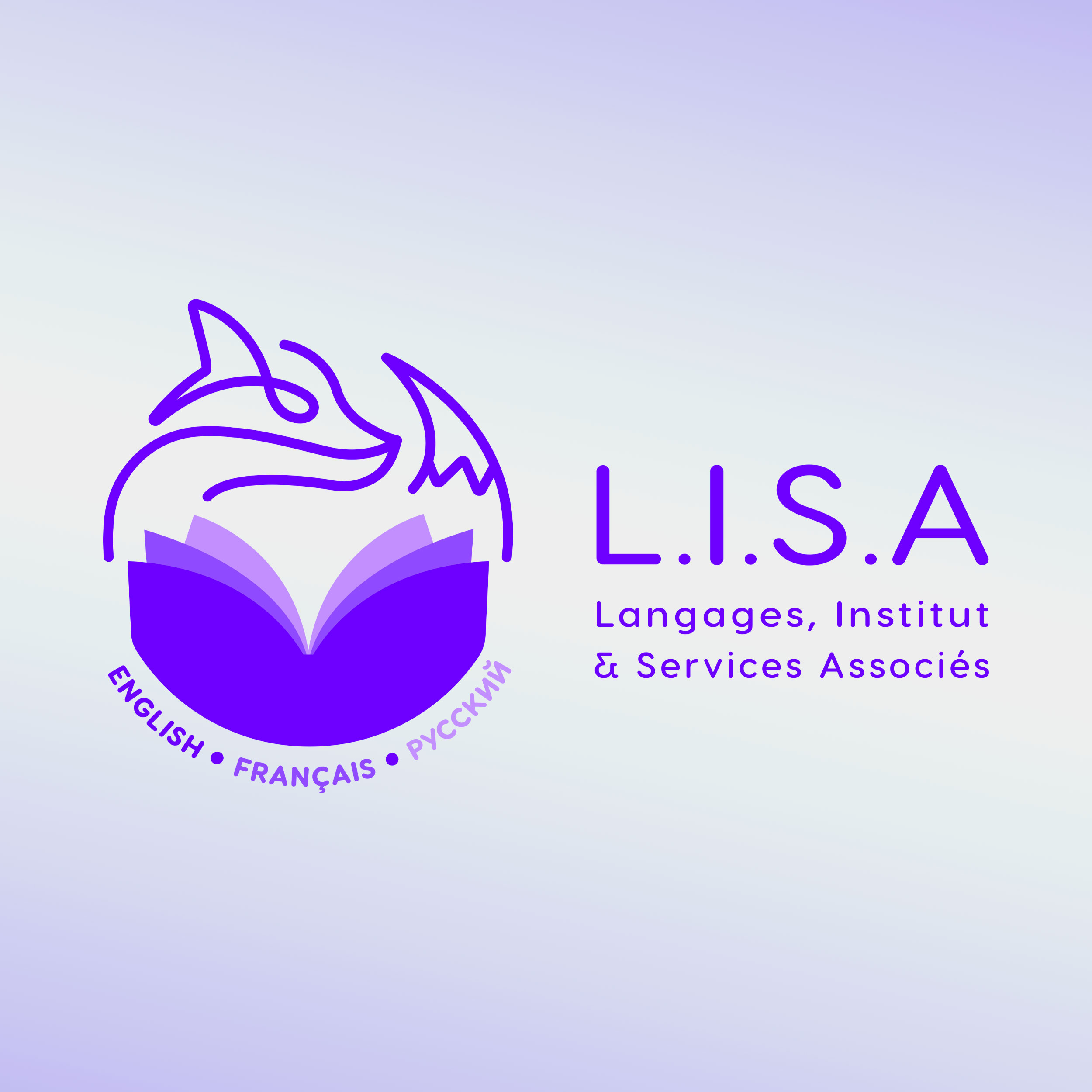
Creation of a strong, meaningful symbol: a stylized, refined, and elegant fox (“Lisa” in Russian), combined with an open book evoking knowledge, learning, and cultural openness;
Development of a coherent visual system: the book with three double-page spreads clearly represents the three languages taught, integrated into a form inspired by the lotus (balance, patience, clarity of mind);
Controlled color palette: institutional purple for print and official materials, with more vibrant variations (blue/mauve) for digital uses and social media;
Clear, understated typography, designed for credible, long-lasting educational communication and adaptable across multiple media;
A flexible, sustainable identity, capable of evolving over time while maintaining strong visual recognition.


